• Home
  • Interiores
    • Bancos
    • Baños
    • Bares
    • Bibliotecas
    • Cafeterías
    • Clínicas
    • Cocinas
    • Estudios / Oficinas
    • Hoteles / Apartamentos
    • Joyerías
    • Ópticas
    • Panaderías / Pastelerías
    • Peluquerías / Centros de estética
    • Piscinas / spas
    • Residencial
    • Showrooms
    • Restauración histórica
    • Restaurantes
    • Stands
    • Uso mixto
    • Vinotecas
    • Otros proyectos
  • Productos
    • Alfombras
    • Baños
    • Bodegas
    • Calefacción
    • Cocinas
    • Complementos
    • Electrodomésticos
    • Griferías
    • Iluminación
    • Infantil
    • Manillas / Herrajes
    • Mecanismos eléctricos
    • Mobiliario
    • Mobiliario oficina
    • Mobiliario exterior
    • Pavimentos
    • Piscinas / spas
    • Revestimientos
    • Textil
    • Ventiladores
  • Especiales
  • Showrooms
  • Entrevistas
  • Agenda
  • Libros
  • Tiendas online
  • Mix
    • 48H Open House Barcelona
    • 48H Open House Madrid
    • Barcelona Design Week
    • Casa Decor
    • Concursos
    • Exposiciones
    • FADfest
    • Feria del Mueble de Milán
    • Feria Hábitat Valencia
    • Valencia Disseny Week VDW
    • Resumen semanal
    • Premios
    • Stockholm Furniture & Light Fair
    • Webs
Home Acerca de Publicidad Contacto
Feria Hábitat Valencia 2026
  • Home
  • Interiores
    • Bancos
    • Baños
    • Bares
    • Bibliotecas
    • Cafeterías
    • Clínicas
    • Cocinas
    • Estudios / Oficinas
    • Hoteles / Apartamentos
    • Joyerías
    • Ópticas
    • Panaderías / Pastelerías
    • Peluquerías / Centros de estética
    • Piscinas / spas
    • Residencial
    • Showrooms
    • Restauración histórica
    • Restaurantes
    • Stands
    • Uso mixto
    • Vinotecas
    • Otros proyectos
  • Productos
    • Alfombras
    • Baños
    • Bodegas
    • Calefacción
    • Cocinas
    • Complementos
    • Electrodomésticos
    • Griferías
    • Iluminación
    • Infantil
    • Manillas / Herrajes
    • Mecanismos eléctricos
    • Mobiliario
    • Mobiliario oficina
    • Mobiliario exterior
    • Pavimentos
    • Piscinas / spas
    • Revestimientos
    • Textil
    • Ventiladores
  • Especiales
  • Showrooms
  • Entrevistas
  • Agenda
  • Libros
  • Tiendas online
  • Mix
    • 48H Open House Barcelona
    • 48H Open House Madrid
    • Barcelona Design Week
    • Casa Decor
    • Concursos
    • Exposiciones
    • FADfest
    • Feria del Mueble de Milán
    • Feria Hábitat Valencia
    • Valencia Disseny Week VDW
    • Resumen semanal
    • Premios
    • Stockholm Furniture & Light Fair
    • Webs
Modernes UI und Klanglandschaft – Magius Casino Nutzerfreundlichkeit bewertet
julio 11, 2026
Share
Modernes Ui

Modernes UI und Klanglandschaft bei Magius Casino

  • Der erste Eindruck im Test
  • Navigation, Tempo und Spielauswahl
  • Klanglandschaft zwischen Ruhe und Reiz
  • Nutzung auf dem Smartphone
  • FAQ
  • Reviews aus unserer Testrunde

Wir haben die Plattform gemeinsam an mehreren Abenden getestet, einmal konzentriert am Desktop, später eher nebenbei auf dem Handy. Unser Ziel war nicht, nur die Anzahl der Slots zu zählen. Uns interessierte vor allem, ob Design, Bedienung und Sound eine stimmige Umgebung schaffen oder ob sich alles nach zu vielen Reizen auf einmal anfühlt. Beim Einstieg über magius casino fiel uns zunächst die klare visuelle Ordnung auf. Der Auftritt wirkt modern, aber nicht übertrieben futuristisch.

Das ist bei Online-Casinos durchaus ein kleiner Vorteil. Manche Anbieter setzen auf dunkle Kulissen, grelle Buttons und animierte Banner, bis die eigentliche Spielsuche fast anstrengend wird. Hier ist das Grundbild ruhiger. Natürlich gibt es Farben, Bewegung und Hinweise auf Aktionen, sonst wäre es kaum ein Casino, doch sie überlagern die zentrale Bedienung nicht vollständig. Unser erster Eindruck war deshalb positiv, wenn auch nicht jeder Bereich gleich aufgeräumt wirkte.

Unsere kurze Einordnung: Die Oberfläche unterstützt das Spielen, statt sich dauerhaft in den Vordergrund zu drängen. Gerade bei längeren Sessions wirkt das angenehmer, als wir zunächst erwartet hatten.

Der erste Eindruck im Test

Auf der Startseite begegneten uns bekannte Casino-Bausteine, etwa Spielkategorien, aktuelle Titel, beliebte Slots und Bereiche mit Aktionen. Entscheidend war für uns, wie diese Elemente zusammenarbeiten. Die Karten der Spiele sind ausreichend groß, die Beschriftungen bleiben auch ohne langes Suchen erkennbar, und die wichtigsten Bereiche liegen sichtbar im oberen Bereich. Das klingt banal, ist es aber nicht. Bei einem Vergleich mit anderen Plattformen mussten wir dort oft mehrfach klicken, um wieder zu einer zuvor gesehenen Kategorie zurückzukehren.

Bei Magius Casino fanden wir die Hierarchie weitgehend nachvollziehbar. Besonders die Abstände zwischen einzelnen Blöcken helfen dabei, dass die Seite nicht wie eine endlose Wand aus Spielautomaten aussieht. Ein wenig widersprüchlich ist allerdings, dass manche Aktionsflächen visuell stärker auftreten als die Filterfunktion. Für neue Besucher kann das eine Weile dauern. Nach wenigen Minuten war uns der Aufbau jedoch vertraut.

Navigation, Tempo und Spielauswahl

Die Nutzerfreundlichkeit zeigt sich selten in einem einzelnen Effekt. Sie steckt eher in kleinen Dingen: Wie schnell lädt eine Kategorie? Bleibt der Weg zurück verständlich? Lassen sich Favoriten und bekannte Titel ohne Umwege finden? In unserer Testrunde lief die Navigation überwiegend flüssig. Das Scrollen wirkte sauber, die Spielkacheln bauten sich ohne auffällige Unterbrechungen auf, und die Auswahl ließ sich nachvollziehbar durchsehen.

Wir mochten besonders, dass die Bedienung nicht nach einer langen Eingewöhnung verlangt. Wer regelmäßig Slots spielt, erkennt die üblichen Strukturen sofort. Wer seltener auf Casino-Seiten unterwegs ist, wird vermutlich ebenfalls zurechtkommen. Ganz perfekt ist der Ablauf trotzdem nicht. Bei sehr vielen Angeboten kann die visuelle Fülle irgendwann wieder zunehmen, vor allem wenn man mehrere Reihen schnell hintereinander durchsucht.

  • Die Kategorien sind klar genug getrennt, um die Orientierung zu erleichtern.
  • Such- und Filterwege fühlen sich im Alltag sinnvoll an.
  • Spielcover liefern schnell einen ersten Eindruck, ohne zu viele Informationen aufzudrängen.
  • Werbeelemente sind vorhanden, blockieren die normale Navigation aber meist nicht.

Ein weiterer Punkt betrifft die Registrierung und die Kontoverwaltung. Diese Bereiche sollten funktional sein und nicht künstlich verspielt wirken. Genau das war in unserem Test überwiegend der Fall. Wichtige Schritte bleiben erkennbar, auch wenn man sich hier und da etwas mehr Erklärung direkt neben einzelnen Optionen wünschen könnte. Gerade bei Einzahlungen, Bonusbedingungen oder Limits ist Klarheit wichtiger als ein besonders auffälliges Layout.

Klanglandschaft zwischen Ruhe und Reiz

Klanglandschaft Zwischen

Der Sound war für uns der interessantere Teil des Tests, weil er bei vielen Casino-Bewertungen fast untergeht. Dabei bestimmt er die Stimmung oft stärker als ein Hintergrundbild. Die Plattform selbst hält sich akustisch eher zurück. Es gibt keine dauerhaft dominante Musik, die sich über jede Seite legt. Das fanden wir angenehm, denn so bleiben die jeweiligen Spielsounds dort, wo sie hingehören, nämlich im Spiel selbst.

Bei Slots entsteht die Atmosphäre ohnehin vor allem durch die Anbieter: Münzklänge, kurze Gewinnsignale, thematische Musik und gelegentliche Sprachsamples. Die Unterschiede sind deutlich. Ein Abenteuer-Slot kann dramatisch wirken, während ein klassischer Früchteautomat fast nostalgisch klingt. Unser Eindruck war, dass die eher neutrale Plattformumgebung diese Vielfalt nicht stört. Man kann den Ton zudem unkompliziert reduzieren oder abschalten, falls man nur nebenbei spielen möchte.

Es gibt dabei einen kleinen Zwiespalt. Klang kann Spannung erzeugen und eine Runde lebendiger machen, doch bei längerer Nutzung können wiederholte Signale auch ermüden. Wir haben deshalb bewusst mit Ton und ohne Ton verglichen. Mit Audio wirkte die Auswahl emotionaler und unmittelbarer. Ohne Audio erschien die Oberfläche fast sachlich. Beides kann passen, je nach Tagesform und persönlicher Gewohnheit.

Nutzung auf dem Smartphone

Auf kleineren Displays entscheidet sich schnell, ob ein modernes Design wirklich durchdacht ist. In unserem Test ließ sich die Seite mobil gut bedienen. Buttons wirkten groß genug, die Karten blieben lesbar, und die Navigation musste nicht ständig vergrößert werden. Das ist kein spektakuläres Lob, aber ein wichtiges. Gerade beim Wechsel zwischen Lobby, Spielansicht und Konto möchten wir nicht dauernd nach dem richtigen Symbol suchen.

Auch hier zeigte sich, dass eine zurückhaltende Gestaltung helfen kann. Weniger dekorative Schichten bedeuten meist mehr Platz für die Dinge, die tatsächlich gebraucht werden. Bei einzelnen Spielen hängt das Erlebnis natürlich zusätzlich vom jeweiligen Softwarestudio ab. Manche Slots sind mobil hervorragend angepasst, andere fühlen sich etwas dichter an als am Desktop. Die Casinoseite selbst blieb in unserer Prüfung aber stabil und übersichtlich.

  • Für kurze mobile Sessions ist die Oberfläche angenehm direkt.
  • Die wichtigsten Menüwege sind mit wenigen Berührungen erreichbar.
  • Die Klangoptionen der Spiele bleiben relevant, wenn unterwegs mit Kopfhörern gespielt wird.

FAQ

Ist das Design auch für Einsteiger verständlich? Nach unserem Test lautet die Antwort überwiegend ja. Die vertraute Aufteilung in Kategorien, Spielansichten und Kontooptionen erleichtert den Einstieg. Wer ganz neu im Online-Casino-Bereich ist, sollte dennoch Hinweise zu Bonusregeln, Zahlungsmethoden und Spielerschutz in Ruhe lesen.

Spielt der Sound für die Nutzerfreundlichkeit wirklich eine Rolle? Unserer Ansicht nach schon. Dezente Plattformgeräusche und anpassbare Slot-Sounds verhindern, dass die Nutzung unnötig hektisch wird. Gleichzeitig bleibt die Stimmung der einzelnen Spiele erhalten, wenn man sie bewusst erleben möchte.

Ist die mobile Ansicht nur eine verkleinerte Desktop-Seite? Sie wirkte auf uns eher wie eine sinnvoll angepasste Version. Einige Inhalte sind kompakter angeordnet, aber die grundlegende Orientierung bleibt erhalten.

Reviews aus unserer Testrunde

Unsere gemeinsame Bewertung fällt insgesamt freundlich aus. Magius Casino überzeugt vor allem durch eine Oberfläche, die modern wirkt, ohne permanent Aufmerksamkeit einzufordern. Die Navigation ist im Normalfall verständlich, die mobile Nutzung solide, und die Klanglandschaft bleibt angenehm flexibel. Kleine Schwächen gibt es bei der optischen Gewichtung einzelner Aktionsbereiche, doch sie verändern das Gesamtbild kaum.

Unterm Strich entstand bei uns der Eindruck einer Plattform, die Atmosphäre nicht allein durch laute Farben oder Daueranimationen erzeugen will. Stattdessen tragen Struktur, Spielauswahl und die jeweiligen Soundwelten der Slots zusammen zur Stimmung bei. Für Spieler, die ein aufgeräumtes Casino-Erlebnis schätzen und trotzdem nicht auf visuelle Dynamik verzichten möchten, ist das eine nachvollziehbare Mischung.

Share

Uncategorized

María José F. Prados

  • JUNG LS 1912
  • REKKER THE ROK
  • Suscríbete a nuestras newsletters

    • DIARIA
    • QUINCENAL
  • CERCLE DEL DESIGN
  • DISEÑO SOLIDARIO

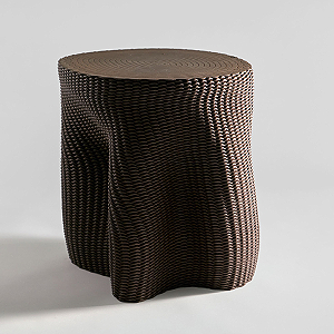
    VALENCIA STOOL

    Valencia Stool de Patricia Urquiola y Andreu World


INSTAGRAM
Proyectada por @poloestudio, esta vivienda en Bilb Proyectada por @poloestudio, esta vivienda en Bilbao (España), perteneciente a una misma familia durante tres generaciones, afrontó una nueva etapa con la llegada de una joven pareja y sus dos hijos. El proyecto reorganizó la planta para establecer una relación más fluida entre hall, salón, comedor y cocina, reduciendo los límites físicos y favoreciendo una concepción más abierta del espacio doméstico. La cocina ocupó una posición central, articulada en torno a una gran isla de cuarcita natural Perla Venata. La orientación sur y la altura de la vivienda potenciaron la entrada de luz natural, mientras el roble, los tonos neutros y los acabados cálidos construyeron una atmósfera serena, atemporal y vinculada a la historia de la casa.

Designed by Polo Estudio, this home in Bilbao, Spain, which had belonged to the same family for three generations, entered a new stage with the arrival of a young couple and their two children. The project reorganised the floor plan to create a more fluid relationship between the hall, living room, dining area and kitchen, reducing physical boundaries and favouring a more open approach to domestic space. The kitchen occupied a central position, structured around a large island made of Perla Venata natural quartzite. The home's south-facing orientation and height enhanced the entrance of natural light, while oak, neutral tones and warm finishes created a serene, timeless atmosphere connected to the home's history.

Fotografía / Photography: Erlantz Biderbost / @biderbost_photo

EL POST COMPLETO EN / FULL POST AT: https://lnkd.in/eGCaGZX5

@idoiaruiz #AddeMedia #PoloEstudio #ErlantzBiderbost #BiderbostPhoto #InterioresMinimalistas #ReformasBilbao #InteriorismoBilbao #ReformaDeVivienda #ReformaIntegral #ProyectosDeInteriorismo #DiseñoDeInteriores #HomeRenovation #InteriorDesignBilbao #InteriorDesignProjects #InteriorDesign #ResidentialInteriorDesign #Bilbao
Proyectada por @poloestudio, esta vivienda en Bilb Proyectada por @poloestudio, esta vivienda en Bilbao (España), perteneciente a una misma familia durante tres generaciones, afrontó una nueva etapa con la llegada de una joven pareja y sus dos hijos. El proyecto reorganizó la planta para establecer una relación más fluida entre hall, salón, comedor y cocina, reduciendo los límites físicos y favoreciendo una concepción más abierta del espacio doméstico. La cocina ocupó una posición central, articulada en torno a una gran isla de cuarcita natural Perla Venata. La orientación sur y la altura de la vivienda potenciaron la entrada de luz natural, mientras el roble, los tonos neutros y los acabados cálidos construyeron una atmósfera serena, atemporal y vinculada a la historia de la casa.

Designed by Polo Estudio, this home in Bilbao, Spain, which had belonged to the same family for three generations, entered a new stage with the arrival of a young couple and their two children. The project reorganised the floor plan to create a more fluid relationship between the hall, living room, dining area and kitchen, reducing physical boundaries and favouring a more open approach to domestic space. The kitchen occupied a central position, structured around a large island made of Perla Venata natural quartzite. The home's south-facing orientation and height enhanced the entrance of natural light, while oak, neutral tones and warm finishes created a serene, timeless atmosphere connected to the home's history.

Fotografía / Photography: Erlantz Biderbost / @biderbost_photo

EL POST COMPLETO EN / FULL POST AT: https://lnkd.in/eGCaGZX5

@idoiaruiz #AddeMedia #PoloEstudio #ErlantzBiderbost #BiderbostPhoto #InterioresMinimalistas #ReformasBilbao #InteriorismoBilbao #ReformaDeVivienda #ReformaIntegral #ProyectosDeInteriorismo #DiseñoDeInteriores #HomeRenovation #InteriorDesignBilbao #InteriorDesignProjects #InteriorDesign #ResidentialInteriorDesign #Bilbao
Proyectada por @poloestudio, esta vivienda en Bilb Proyectada por @poloestudio, esta vivienda en Bilbao (España), perteneciente a una misma familia durante tres generaciones, afrontó una nueva etapa con la llegada de una joven pareja y sus dos hijos. El proyecto reorganizó la planta para establecer una relación más fluida entre hall, salón, comedor y cocina, reduciendo los límites físicos y favoreciendo una concepción más abierta del espacio doméstico. La cocina ocupó una posición central, articulada en torno a una gran isla de cuarcita natural Perla Venata. La orientación sur y la altura de la vivienda potenciaron la entrada de luz natural, mientras el roble, los tonos neutros y los acabados cálidos construyeron una atmósfera serena, atemporal y vinculada a la historia de la casa.

Designed by Polo Estudio, this home in Bilbao, Spain, which had belonged to the same family for three generations, entered a new stage with the arrival of a young couple and their two children. The project reorganised the floor plan to create a more fluid relationship between the hall, living room, dining area and kitchen, reducing physical boundaries and favouring a more open approach to domestic space. The kitchen occupied a central position, structured around a large island made of Perla Venata natural quartzite. The home's south-facing orientation and height enhanced the entrance of natural light, while oak, neutral tones and warm finishes created a serene, timeless atmosphere connected to the home's history.

Fotografía / Photography: Erlantz Biderbost / @biderbost_photo

EL POST COMPLETO EN / FULL POST AT: https://lnkd.in/eGCaGZX5

@idoiaruiz #AddeMedia #PoloEstudio #ErlantzBiderbost #BiderbostPhoto #InterioresMinimalistas #ReformasBilbao #InteriorismoBilbao #ReformaDeVivienda #ReformaIntegral #ProyectosDeInteriorismo #DiseñoDeInteriores #HomeRenovation #InteriorDesignBilbao #InteriorDesignProjects #InteriorDesign #ResidentialInteriorDesign #Bilbao
Proyectada por @fransilvestrearquitectos, la NIU N Proyectada por @fransilvestrearquitectos, la NIU N320 es una vivienda de 321,5 m² que desarrolla la filosofía del proyecto NIU: hacer posible una arquitectura más sostenible y asequible mediante la sistematización de los procesos constructivos. Organizada en dos plantas, la vivienda conecta las zonas de día y descanso con el exterior a través de amplias terrazas cubiertas. Una estructura metálica ligera, una fachada ventilada y unos interiores íntegramente realizados en madera definen su carácter constructivo. El proyecto incorpora además estrategias bioclimáticas, como la orientación norte-sur, la ventilación cruzada y un forjado sanitario que contribuye al acondicionamiento térmico. La reutilización del agua de condensación y cuatro opciones de acabado completan una propuesta centrada en la precisión, la eficiencia y el confort.

Designed by Fran Silvestre Arquitectos, NIU N320 is a 321.5 m² home that develops the philosophy behind the NIU project: making more sustainable and affordable architecture possible through the systematisation of construction processes. Organised over two floors, the house connects its living and private areas with the outdoors through generous covered terraces. A lightweight steel structure, ventilated façade and fully timber interiors define its construction approach. The project also incorporates bioclimatic strategies, including north-south orientation, cross ventilation and a ventilated floor slab that contributes to thermal conditioning. The reuse of air-conditioning condensation water and four finish options complete a proposal focused on precision, efficiency and comfort.

Fotografía / Photography: @fernandogguerra 

EL POST COMPLETO EN / FULL POST AT: https://interioresminimalistas.com/niu-n320-arquitectura-industrializada-precisa-y-sostenible-fran-silvestre-arquitectos/

#FranSilvestreArquitectos #JesúsOrrico #FernandoGuerra #InterioresMinimalistas #ArquitecturaIndustrializada #ArquitecturaSostenible #ViviendaContemporánea #ArquitecturaResidencial #DiseñoBioclimático #EficienciaEnergética #ConstrucciónSostenible #IndustrialisedArchitecture #SustainableArchitecture #ContemporaryHome #ResidentialArchitecture #Valencia
Proyectada por @fransilvestrearquitectos, la NIU N Proyectada por @fransilvestrearquitectos, la NIU N320 es una vivienda de 321,5 m² que desarrolla la filosofía del proyecto NIU: hacer posible una arquitectura más sostenible y asequible mediante la sistematización de los procesos constructivos. Organizada en dos plantas, la vivienda conecta las zonas de día y descanso con el exterior a través de amplias terrazas cubiertas. Una estructura metálica ligera, una fachada ventilada y unos interiores íntegramente realizados en madera definen su carácter constructivo. El proyecto incorpora además estrategias bioclimáticas, como la orientación norte-sur, la ventilación cruzada y un forjado sanitario que contribuye al acondicionamiento térmico. La reutilización del agua de condensación y cuatro opciones de acabado completan una propuesta centrada en la precisión, la eficiencia y el confort.

Designed by Fran Silvestre Arquitectos, NIU N320 is a 321.5 m² home that develops the philosophy behind the NIU project: making more sustainable and affordable architecture possible through the systematisation of construction processes. Organised over two floors, the house connects its living and private areas with the outdoors through generous covered terraces. A lightweight steel structure, ventilated façade and fully timber interiors define its construction approach. The project also incorporates bioclimatic strategies, including north-south orientation, cross ventilation and a ventilated floor slab that contributes to thermal conditioning. The reuse of air-conditioning condensation water and four finish options complete a proposal focused on precision, efficiency and comfort.

Fotografía / Photography: @fernandogguerra 

EL POST COMPLETO EN / FULL POST AT: https://interioresminimalistas.com/niu-n320-arquitectura-industrializada-precisa-y-sostenible-fran-silvestre-arquitectos/

#FranSilvestreArquitectos #JesúsOrrico #FernandoGuerra #InterioresMinimalistas #ArquitecturaIndustrializada #ArquitecturaSostenible #ViviendaContemporánea #ArquitecturaResidencial #DiseñoBioclimático #EficienciaEnergética #ConstrucciónSostenible #IndustrialisedArchitecture #SustainableArchitecture #ContemporaryHome #ResidentialArchitecture #Valencia
Proyectada por @fransilvestrearquitectos, la NIU N Proyectada por @fransilvestrearquitectos, la NIU N320 es una vivienda de 321,5 m² que desarrolla la filosofía del proyecto NIU: hacer posible una arquitectura más sostenible y asequible mediante la sistematización de los procesos constructivos. Organizada en dos plantas, la vivienda conecta las zonas de día y descanso con el exterior a través de amplias terrazas cubiertas. Una estructura metálica ligera, una fachada ventilada y unos interiores íntegramente realizados en madera definen su carácter constructivo. El proyecto incorpora además estrategias bioclimáticas, como la orientación norte-sur, la ventilación cruzada y un forjado sanitario que contribuye al acondicionamiento térmico. La reutilización del agua de condensación y cuatro opciones de acabado completan una propuesta centrada en la precisión, la eficiencia y el confort.

Designed by Fran Silvestre Arquitectos, NIU N320 is a 321.5 m² home that develops the philosophy behind the NIU project: making more sustainable and affordable architecture possible through the systematisation of construction processes. Organised over two floors, the house connects its living and private areas with the outdoors through generous covered terraces. A lightweight steel structure, ventilated façade and fully timber interiors define its construction approach. The project also incorporates bioclimatic strategies, including north-south orientation, cross ventilation and a ventilated floor slab that contributes to thermal conditioning. The reuse of air-conditioning condensation water and four finish options complete a proposal focused on precision, efficiency and comfort.

Fotografía / Photography: @jesusorrico 

EL POST COMPLETO EN / FULL POST AT: https://interioresminimalistas.com/niu-n320-arquitectura-industrializada-precisa-y-sostenible-fran-silvestre-arquitectos/

#FranSilvestreArquitectos #JesúsOrrico #FernandoGuerra #InterioresMinimalistas #ArquitecturaIndustrializada #ArquitecturaSostenible #ViviendaContemporánea #ArquitecturaResidencial #DiseñoBioclimático #EficienciaEnergética #ConstrucciónSostenible #IndustrialisedArchitecture #SustainableArchitecture #ContemporaryHome #ResidentialArchitecture #Valencia
Reformada por el arquitecto Boris Denisyuk, de @bu Reformada por el arquitecto Boris Denisyuk, de @burofive, Villa Monteville recuperó su coherencia espacial tras años de modificaciones y ampliaciones. El proyecto planteó la arquitectura y el interiorismo como un único sistema, construido a partir de una lógica común de espacio, luz y proporción. La intervención tomó el interior como punto de partida y convirtió la luz en una herramienta fundamental para organizar la vivienda. La eliminación de un ascensor permitió abrir un patio de luz interior que pasó a articular los diferentes niveles, recorridos y perspectivas. El resultado fue una vivienda sobria y minimalista, en la que arquitectura, interiorismo y escala humana quedaron estrechamente vinculados.

Renovated by architect Boris Denisyuk of Buro5, Villa Monteville recovered its spatial coherence after years of modifications and extensions. The project conceived architecture and interior design as a single system based on a shared logic of space, light and proportion. The intervention took the interior as its starting point and made light a fundamental tool for organising the home. Removing an elevator opened up an interior light courtyard that became the connecting element between the different levels, circulation routes and perspectives. The result was a restrained and minimalist home in which architecture, interior design and human scale were closely interconnected.

Fotografía / Photography: @skrasyuk 

EL POST COMPLETO EN / FULL POST AT: https://interioresminimalistas.com/2026/08/31/villa-monteville-la-casa-que-recupero-su-propia-luz-buro5/

#CasasMinimalistas #Arquitectura #Interiorismo #DiseñoDeInteriores #ReformaArquitectónica #ProyectosDeReforma #ViviendaContemporánea #ArquitecturaResidencial #Minimalismo #InterioresMinimalistas #MinimalistHomes #Architecture #InteriorDesign #ArchitecturalRenovation #RenovationProjects #ContemporaryHomes #ResidentialArchitecture #MinimalistArchitecture #InteriorArchitecture #Minimalism
Reformada por el arquitecto Boris Denisyuk, de @bu Reformada por el arquitecto Boris Denisyuk, de @burofive, Villa Monteville recuperó su coherencia espacial tras años de modificaciones y ampliaciones. El proyecto planteó la arquitectura y el interiorismo como un único sistema, construido a partir de una lógica común de espacio, luz y proporción. La intervención tomó el interior como punto de partida y convirtió la luz en una herramienta fundamental para organizar la vivienda. La eliminación de un ascensor permitió abrir un patio de luz interior que pasó a articular los diferentes niveles, recorridos y perspectivas. El resultado fue una vivienda sobria y minimalista, en la que arquitectura, interiorismo y escala humana quedaron estrechamente vinculados.

Renovated by architect Boris Denisyuk of Buro5, Villa Monteville recovered its spatial coherence after years of modifications and extensions. The project conceived architecture and interior design as a single system based on a shared logic of space, light and proportion. The intervention took the interior as its starting point and made light a fundamental tool for organising the home. Removing an elevator opened up an interior light courtyard that became the connecting element between the different levels, circulation routes and perspectives. The result was a restrained and minimalist home in which architecture, interior design and human scale were closely interconnected.

Fotografía / Photography: @skrasyuk 

EL POST COMPLETO EN / FULL POST AT: https://interioresminimalistas.com/2026/08/31/villa-monteville-la-casa-que-recupero-su-propia-luz-buro5/

#CasasMinimalistas #Arquitectura #Interiorismo #DiseñoDeInteriores #ReformaArquitectónica #ProyectosDeReforma #ViviendaContemporánea #ArquitecturaResidencial #Minimalismo #InterioresMinimalistas #MinimalistHomes #Architecture #InteriorDesign #ArchitecturalRenovation #RenovationProjects #ContemporaryHomes #ResidentialArchitecture #MinimalistArchitecture #InteriorArchitecture #Minimalism

© Copyright Interiores Minimalistas 2026